Your homepage is the first thing your potential customers will see whenever they check out your website. You only have a few fractions of seconds to grab the attention of your visitors and persuade them to keep scrolling through your website. If you do not make the most out of those first few milliseconds, you may end up losing many potential customers. That is why an attention grabbing website homepage is the ultimate chance to make a long-lasting impression. It makes your visitors learn more about your brand and the product or services you offer.
Your homepage copy introduction plays a significant role in determining how well your entire homepage does. Hence, here are 24 attention-grabbing website homepage introductions that can give you just the right inspo for curating a homepage for your website. We also have listed a few tips to help you pave your way through the complicated process of creating a homepage with a breeze. Let’s get started.
Your homepage introduction is the first thing your visitor will see when they open your website. It serves as the ultimate elevator pitch to letting your visitors know about your business. Here are some great tips that will help you design a homepage, bringing maximum clicks and scroll rates to your website while converting the visitors to loyal customers!
The motto of your homepage is to show visitors what they are looking for, portray your services, establish your company’s credibility and let them know where to start their journey from. However, the prime motto is to persuade them into choosing your business.
If your products and services require more information than usual, go ahead but don’t go overboard!
On the other hand, if it is something your visitors would be already familiar with, going short is the right choice with your homepage introduction. Ideally, you need to get the textual things done within just one to three sentences in total. Why? Because the majority of your prospects are just scanning your website and not reading everything thoroughly.
If you keep a lengthy introduction, they may read the entire thing, but they will definitely skip on the parts supposed to drive the conversions. Furthermore, since most people have a short attention span, they can easily get distracted and leave midway while reading the entire passage.
Here’s an example of Spotify’s homepage wherein the headline itself illustrates what their company is all about. They have also mentioned their CTAs very prominently so that visitors do not get distracted on this page.

If you are confused between a long homepage and a short one, here’s an example of Pipedrive that created two different homepage variants and analyzed the results.

The shorter variant was more effective in driving conversions compared to the long one since the shorter one brought a 300% hike in conversions for Pipedrive!
One of the common reasons you are not gaining conversions from your website is that your visitors simply don’t know what to do! Of course, they want to become a customer, but they don’t really know-how. Irrespective of how captivating your web design is or even created by a reputable web design agency. If they do not know how to convert from your homepage, it doesn’t help to reach your business goals.
This is why, apart from having a short explanation about your business, your homepage should also have multiple prominent CTAs to direct customers on the entire process.
Here’s how Southwest helps visitors turn into customers with the right use of CTAs.

As soon as you visit their homepage, you are instructed to set the departure and return dates along with a promo code space as a CTA for them to book the ticket right away. The $49 rate on their flights and Book Now are more powerful CTAs that can compel the users to at least check their flight dates on the website and later make the bookings!

Similarly, Memrise is another attention-grabbing website that has a different call to action. Here it doesn’t have your regular call to action buttons. Why? This is because they have about 23 different languages to learn. It clearly makes no sense to create individual CTAs for multiple languages. Instead, they direct visitors into searching for their desired language and start learning quickly.
The most prominent aspect of your homepage introduction is the main headline and its placement. You can always include photos, videos, testimonials, and so much more on your homepage, but the headline should take up more space compared to the other elements.
Here’s how Slack placed different homepage elements while allotting a decent space to the headline – Slack is where the future works to keep it more prominent.

Another excellent example to demonstrate this tip is the attention-grabbing website homepage of Google Drive. The headline – Easy and secure access to all of your content immediately attracts the visitor’s attention. They have also placed the CTAs very strategically right below it with two contrasting colors to encourage visitors to take action.

As we said, the placement of your headline is also very important in creating an attention-grabbing website homepage introduction. You need to ensure that the headline of your homepage stays above the fold irrespective of the device your visitors use to visit your website.
The term “above the fold” refers to the portion of the web page that visitors can view without scrolling further. It is what they see right when they land on the page and make the first impression.
If your visitors like what they see in the first portion of your homepage, they are likely to scroll even further and learn more about your business and take the desired action. Hence, it is important to place the headline and the most powerful content above the fold of your homepage.
Let’s check out the homepage of Duolingo. Here you can find two simple yet compelling sentences which make all the difference in converting the visitors. The CTAs here are straightforward.

However, in case your business is not as simple as Duolingo, here’s an example of the homepage of Palantir, a web agency that offers different marketing services to businesses.

The homepage of Palantir has a very prominent and large headline that grabs attention in a mere fraction of seconds! Next, they have a short description of their services and a powerful CTA to drive the leads.
Since the first fold is already very interesting, visitors can scroll further and check out company testimonials, case studies, and other aspects of their business.
The purpose of the headline on your homepage is to compel visitors to read further and learn more about the business throughout the complete homepage. Hence, the next most important aspect to building an attention-grabbing website homepage is the headline copy.
As we said, the key is to be minimalistic yet informative. You need to create a unique headline copy that makes your business stand out from the rest.
Your visitors will probably be tired of the same headline that every other website has. This is where you can create a memorable impression by being completely unique and captivating. In the example of the homepage of Audible, instead of having a description about their services, they have chosen a bold and unique claim in their headline – Stay Connected, Informed, and Inspired, which describes their services seamlessly.
They also have a discount portion which is highly powerful to compel visitors into availing their offer and choosing their services.

However, this is easier for well-known brands like Audible, Google, Apple, etc., since most people already know about these brands.
Needless to say, it works pretty the same for small businesses and startups too!
Check out the homepage of Lyft, which has a unique headline – Hop in. Crack a Window. Let’s get back out there with two very prominent CTAs right below it.

The best way to increase your website conversions is to show them the value of your services right when they enter your website. For example, if your business is a cost-effective solution, mention that. Similarly, highlight anything which is unique and again makes your brand a better option over your competitors.
This way, visitors can now stop searching for your competitors and settle for your services. ClickTime’s homepage describes its product to its users within the first few lines in a very concise manner.

Let’s analyze another example.
The homepage of PNC bank here has a similar approach. They mention their services in the headline – Checking and Savings. Together. Below it, they have a quick and
The headline itself mentions their services – Timesheet that drives performance and the small description below that demonstrates the value of choosing their services.

As we repeatedly mentioned in this post, the placement of the call to action is another crucial factor in the success of your conversions. A direct call to action is always better than tough jargon, which can confuse your visitors. Likewise, you need to ensure the CTA button is easily visible to your visitors whenever they visit your website. Prevent overshadowing your CTA with other elements since the CTA is the prime button to account for the conversions.
Furthermore, the more options you offer your visitors on the home screen, the less the chances to convert them since it hinders their decision-making process. The fewer elements your website has, the quicker the process of scoring conversions on the website.
Let’s check out how different elements are organized on the homepage of Aspiration.

Here you can find a simple heading, subheading, and strong CTA for the visitors. There is no way visitors can get confused when they visit the homepage of Aspiration since there are not many choices here to choose from. They have a clear direction as to what they should do after learning about their services.
The homepage of Care/of also has a similar approach. You can find a simple heading, subheading, and CTA on the homepage. The call to action is placed at a point that is impossible to miss.

People perceive visual cues the best compared to textual information. You need to focus on the visuals in your homepage introduction since the more attractive it gets, the better the chances of the visitor acting as per the CTA. However, don’t go overboard since the CTA and the headline are still the prime focus.
Take a look at the example from NeverBland to understand it better. They do not have any specific graphics. Just the monotone background with prominent headings and CTAs are enough to drive conversion for them.

They took the leverage of statistics and data to portray how their services can help with their customer needs which is a great move to build the brand’s credibility.
Here’s how Starbucks advertises their frappuccinos on their homepage with minimalistic visuals.

With the right visuals on your homepage, you can easily grab the attention of your visitors and lure them into being your customers in no time! Here’s another example of a visually compelling homepage of AllTrails.

They offer an app with maps of parks and trails. The homepage visual is about a woman walking with their dog, which makes it easy for the visitors to assume their services well.
Similarly, you can also add screenshots of the app’s interface on your homepage to make it more interactive. However, ensure that it doesn’t distract them from the main goal – Clicking on the CTA.
Select images that represent your business the best. Avoid carousel pictures since these distract visitors for a prolonged time. Furthermore, it also affects the SEO and user experience since the more carousels you add to your homepage, the slower the pages get while loading. Carousels also tend to push more content below the fold, which we have already discussed above.
Here’s another example of a good balance of graphics with the other elements in a homepage by Mailchimp.

Therefore, when you choose the graphics for your homepage, ensure to focus on the ones that are visually compelling and simplistic.
Like we already discussed, having a minimalistic approach goes a long way in scoring conversions. However, you need to consciously incorporate the white space in your homepage too.
The homepage is a very pivotal aspect to separate the texts, graphics, and other elements in the homepage. It prevents the homepage from looking clustered. Check out the homepage of Sellfy here.

Like the other example, Sellfy has a logical flow of elements throughout its homepage. A large amount of white space on the page makes the green CTA pop out, which is excellent to make it more prominent to the visitors.
Apple also has a similar approach in their official website.

They have advertised their latest launch, the iPhone 13 Pro, with a minimalist approach. The smartphone was the prime attraction here and the only visual the visitor can see on their homepage. This way, the visitor knows exactly what they need to do whenever they land on the page, resulting in a confirmed conversion!
You may not be able to convey or portray everything to the visitor right on the homepage. If your product is simple, you have the advantage of adding the maximum information on the homepage itself. However, you will also have to add the company’s background, testimonials, case studies, and so much more within the same homepage. We already discussed that shorter homepages work better than the longer ones; there should obviously be an alternative to this.
You do not need to include all the information on your homepage right from the start. Just focus on writing a compelling headline to pitch to the visitor and grab their attention when they enter your website. Make them spend a larger duration on your website and learn about your services from your website. Here you can accomplish the goal by depending on your company’s identity and goals. Here’s how Wix achieved their goals of creating an incredible and high converting homepage.

Here Wix has conveyed their services with just a few sentences and a minimalistic approach. Also, their homepage is focused on a broader audience since they offer website building services to every business owner irrespective of whether they are a startup or an MNC.
The key is to focus on grabbing the user’s attention. Rest, go with a simple approach without including too amend entails to the services. Here’s another example of the homepage of Dyson.

They simply have included their discounts and offers right under the headline to grab the visitor’s attention real quick!
Lastly, you need your homepage to portray the personality of your brand. The value of the services of your business may be the selling point, but the brand identity also plays a major role in converting the right audiences for your business.
Here’s how the newsletter Lorem Ipsum encourages visitors to sign up from their homepage.

The entire homepage is simple and represents the brand personality well.
Next, Mr.Holmes Bakehouse. This is another example that has some really humorous and funny sentences on their homepage, demonstrating their personality accurately.

This approach is effective since every brand requires consistency in their voice and tones, which these brands have thoroughly followed.
Another creative and well-established homepage example is from Extremely good parenting.

Crafting the website homepage introduction can make the ultimate difference your business needs this year. If you lack conversions and sales, these attention-grabbing website homepage introductions can be a great source of motivation and inspiration to create a new one for your website. Ensure to balance different elements on your website well while keeping the headline and the CTA as the main priority.
Play with graphics but keep it minimalist. Lastly, make your homepage unique to stand out from your competitors. Even though creating a new homepage takes time and effort, with these steps into consideration, you can easily make one for your business in no time!

The best lifetime deal platforms for software. Platforms lik RocketHub scour the web for the highest quality products to bring buyers the best lifetime deals on their platform.

Do you ever wonder if being your own boss could truly set you free? In this article, we’ll explore the theory that unleashing entrepreneurial freedom
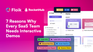
Making a Case for Interactive Demos: 7 Reasons Why Every SaaS Team Needs Them Let me paint a scenario for you. You want to buy