Did you know that the SaaS industry is currently worth over $145 billion? With so many SaaS startups emerging every year, it can be slightly tough to stand out in a crowded market. However, one of the fundamental and best ways to outshine other companies in the SaaS industry is to build an attractive and responsive website for your SaaS startup. A website is typically the online presence of a company.
Your website is the first thing your prospect will view before signing up for your services. A website typically has just a few seconds to make a positive impression on the prospect and encourage them to check the website further, resulting in a sale. If you have a budding SaaS startup and are looking for some inspo to build your new website or even revamp your existing one, take a look at the list we curated of the top 10 best SaaS websites and understand why they work.
For starters, you may already know what SaaS is. Software as a Service (SaaS) offers software solutions to customers for a variety of requirements. There are SaaS companies in varied industries such as Fintech, Enterprise, Cybersecurity, and more.
Now, a SaaS website is the face or the online presence of the company. Your SaaS website has a landing page and a homepage, one of the first things visitors see when they find your business. Thus, it plays a crucial role in the conversion rates. Your website consists of your company information and answers to any possible questions in your prospect’s mind. Since SaaS is web-based, your SaaS startup website also depicts your vision, mission, and product. It is how you portray your brand in front of your prospects and customers.
There is no perfect spice that can transform your SaaS website into a high converting one. It is a mixture of different elements that makes a SaaS website successful. The human attention span is as short as 15 seconds, making it tough for SaaS owners to grab the visitor’s attention and encourage them to stay on their website. Thus, here are some mandatory elements that make a good SaaS website that can convince the prospects to stick around for long and even make a purchase.
As a SaaS owner, you will already have a brand image and vision. Since your Saas startup website is the face of your startup, you need to replicate the same in your website too. Your SaaS website should deliver a consistent and predictable experience to visitors. You should place the right elements at the right parts of the pages, which stands out and guides the visitor to navigate seamlessly, and consistency is an ultimate requirement here.
Apart from easier navigation, having a responsive website also helps with the SERP rankings of the business. A responsive website indicates that it should easily function well across different devices such as smartphones, tablets, computers, etc. there shouldn’t be any problem scrolling throughout the web pages when someone accesses the website from different devices. There should be a consistent user experience irrespective of the device used to access the website.
Your website should also be accessible and easy to navigate. It should have the right colors and fonts suitable for visually impaired people with color blindness and help them have the same experience as others. Ensure to make your SaaS website visually appealing and streamline the process of conversion from the landing page to the final payment page to make it more convenient. While designing a website, you may put yourself in the shoes of a complete beginner who is completely naive in technology or working with devices. This way, you can make your website the most accessible for your customers.
Next, a successful SaaS website is never based on assumptions. Focus on different data and analytics to understand what design elements bring the best user experience to the customers. While creating a website, start from a very simple and minimalistic approach instead of jumping to flashy graphics. Simply include the company colors, logo, font based on the brand image. Based on user experience data, you can incorporate the other elements in your website and maximize the functionality over time. You may also consider leaving out a white space to keep things more systematic, neat, and minimalistic like Evernote did, which we will explain further.
Be it an upcoming startup or an established enterprise. Every SaaS business should offer free demos and trails to its products. Similarly, mention the same on your website, too, especially on the homepage and the landing page, to grab the attention of the visitors. It can encourage the visitors to at least try out the product instead of directly making a commitment.
The term above the fold simply indicates the first part of the homepage or any web page your visitors see when they open your website. Ensure to add all the call-to-actions (CTAs), freed emos, and other important elements designed to drive conversions in the above fold. The above-the-fold content in your landing page and homepage should be compelling, impactful, and relevant to persuade visitors to scroll the web page and learn more about it.
Here’s an example of Salesforce that has included all the important elements above the fold, contributing to a successful conversion.

A good CTA is one of the prime factors for driving conversions and sales to your business. Hence, ensure to place the CTA prominently to attract the visitors and compel them into subscribing or making the purchase. You may also work with different colors to make it stand out from the other website elements, which we have explained further in the examples of successful SaaS websites. Either way, the goal is to help visitors spot the CTA quickly and take action accordingly.
After grabbing your visitor’s attention from above-the-fold content, you need to ensure that they stick to your website for a prolonged time. This is when the social proof comes into the picture. Don’t just demonstrate the benefits of your services or products and dictate why it is the best for them. Instead, show them how your SaaS business has helped other businesses or customers with their requirements with case studies and testimonials. This will help in building trust and make them feel secure in investing in your business.
Now that you know the important elements of a successful SaaS startup website, let’s check out the best practices to optimize your SaaS website for scoring the maximum conversions.
According to Biteable, 74% of marketers claim that video brings a better return on investment compared to simple imagery. Thus, include videos on your website since it can help grab the attention of the viewers well and build a better impression. If you want to develop an impactful impression, create an engaging video for your website, making your visitor spend a long time exploring your website, resulting in more conversions. See the example below of the RocketHub site using a quick video about the hottest deal on the site.

Pro Tips: You can use an amazing video marketing tool, PageNudge to create a personalized video and easily put it anywhere on your site. PageNudge also allows you to add a customized call-to-action button to ask your website visitors to take action. Check out all the lifetime deal plans today before it’s gone!
Since your SaaS product is catered to target a specific audience base, follow the same for the website. The first step for targeted messaging is creating buyer personas from different data and analytics. Then identify a specific messaging that resonates best with your target audience and incorporate it into your website. This should be implemented in your landing pages, homepage, and other web pages consistently.
Your visitors visit your website to learn more about your products. Thus, ensure that you provide the answer to every query, doubt, or confusion that they may have with your business. Create a list of features and the functionalities your products or services offered, demonstrate the working of the product in a comprehensive yet lucid manner. Lastly, add the complete contact information, including the contact number, email ID, address of the office, and others, to help them find a way to reach you quickly. Consider adding all the contact details on every web page to ensure visitors can always find your contact details from any page with just a single click.
The key to a successful SaaS company is transparency.s since your website is the face of your company, it should contain every nitty-gritty information about the pricing plans and other charges, if any, which are imposed on a purchase. You may also list out the features and perks as per every plan to ensure everybody is on the same page.
Check out the pricing page of Mailchimp, wherein you can find all the features and facilities listed under each plan and their prices.

Now that we have discussed the required elements and the best practices of building a successful SaaS startup website let’s check out how other SaaS businesses have built their website, contributing to thousands or millions of profit in their business.

Hubspot offers marketing automation tools and CRM software to help businesses with their sales and marketing needs. Even though they have described their services well on the above-the-fold area of the homepage with the CTA of a demo or freemium, they have also clarified their list of services and features right below it. This helps establish transparency with the visitors and educate them about the services provided by Hubspot and its features.

Wufoo is a robust cloud-based form builder that also helps organizations create and share forms in their workplace. The tagline is focused on the USP of the company, while the short description below offers a small insight into their services. They have also included a video on the right-hand side demonstrating how their software works and benefits the customers. Lastly, they also added CTAs for sign-ups and live demos, giving customers an option to explore the services instead of committing to a plan.

Rapportive is a simple software that helps users pull contact and other crucial information right from their email inbox. When the user opens their account and clicks on contact, it brings the relevant data and information about the person from their LinkedIn profile. Their web page has a large screenshot of how their software works, with a strong CTA, placed prominently in yellow. This bright CTA is strategically placed to take action and download the application right away, which is a great combination of demonstrating the product functionality as well as the CTA under a single page together.

Dropbox is popular for its minimalist and simple web designs. They keep every element strategically to quickly convert their prospects. Right on their landing page, you can find a list of the key features when you tap on Features on top. Next, it also consists of other elements which direct users to other web pages to find the relevant information. Their bold statement and the CTAs do a great job in converting the prospects since it is highlighted in blue that is very eye-catching!

Evernote offers SaaS solutions for businesses that are catered to streamline busy and complex workflows. Their software helps take notes, schedule tasks, and other facilities that help businesses in their workflow. Their homepage has a very bright CTA with an incentive that makes it 2x more convincing for the visitors to convert. Similarly, they have kept a large white space to prevent cluttering of the website elements. Yet, they have managed to convey their brand information through a simple and short tagline. Apart from this, they have also included the links to be directed to other web pages that can educate the visitors more about their business to improve the chances of conversion.

SquareUp offers different tools that help businesses accept payments from different geographic locations and payment options. Similar to Evernote, the homepage of Squareup is also mostly covered with white space to prevent cluttering with an impactful tagline and CTA for conversion. They also give an option to contact their sales team if the visitor has a doubt in their mind, which is also a smart trick. Why? If the visitor is not convinced to convert only by viewing the elements on the homepage, they can connect with the sales team and know more about the business to get a better view.

Mint has a very engaging homepage that can instantly catch the attention of visitors. Why? The strategic combination of colors with the video demonstrating the working of the software is powerful enough to score conversions quickly. Even though you may find too many elements present above the fold, it still looks well organized and neat. How? The color contrast in the background is light that shifts the focus towards the main attractions of the website, such as their Mint Financial Coach on the top, the video of a person using mint, or the CTA.

As per the image, Airbnb offers travel-related services. Well, rightfully so, Airbnb offers travel accommodations to customers globally. Their simplistic approach of having a cozy tent in the forest is very impactful and has soothing graphics that can persuade the visitors to stay and explore the website. Next, the CTA is strategically placed, which asks the users information about their next trip and then brings them to the list of options for their next destination with Airbnb, which is a super-genius approach!

Zooz is another payment platform that helps businesses get paid and simplify payment methods in mobile applications and more. Their homepage consists of a concise explanation explaining their USP and a list of tabs on the top, which brings down a list of their features and facilities. The graphic used here demonstrates their software, and the CTA is placed with an orange background to highlight it to the visitors and encourage them to take action.

Typeform makes filling forms and surveys quick and simple. Their software is catered for creating and designing the most attractive forms that businesses can use for gaining feedback and other essential requirements. And their tagline mentions the same. They also have a very simple and clean homepage with only the required elements to make the CTA pop. Even if the above-the-fold area was basic, the content below has everything a new visitor needs to know about their business which serves the purpose well.
An optimized and well-curated SaaS startup website is the most essential, fundamental, and non-negotiable aspect of making your business successful. Hiring a website developer to make your website optimized and attractive for visitors is always recommended if you are not a pro in website development. Even if it may demand an investment, the ROI can be 10x higher if your business succeeds in the long run. Thus, analyze the website inspirations from the above-mentioned SaaS startup websites and implement them according to your website to effectively drive more visitors and convert them into loyal customers for your business.


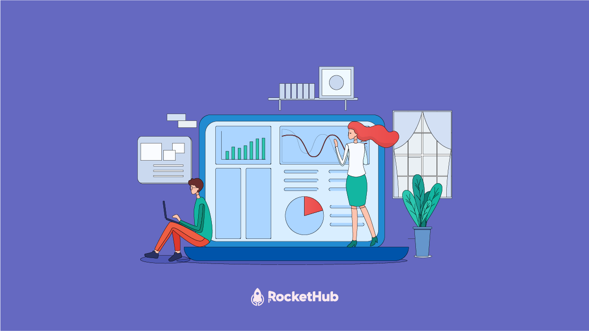
The best lifetime deal platforms for software. Platforms lik RocketHub scour the web for the highest quality products to bring buyers the best lifetime deals on their platform.

Do you ever wonder if being your own boss could truly set you free? In this article, we’ll explore the theory that unleashing entrepreneurial freedom
Making a Case for Interactive Demos: 7 Reasons Why Every SaaS Team Needs Them Let me paint a scenario for you. You want to buy